


Camden at the Falls
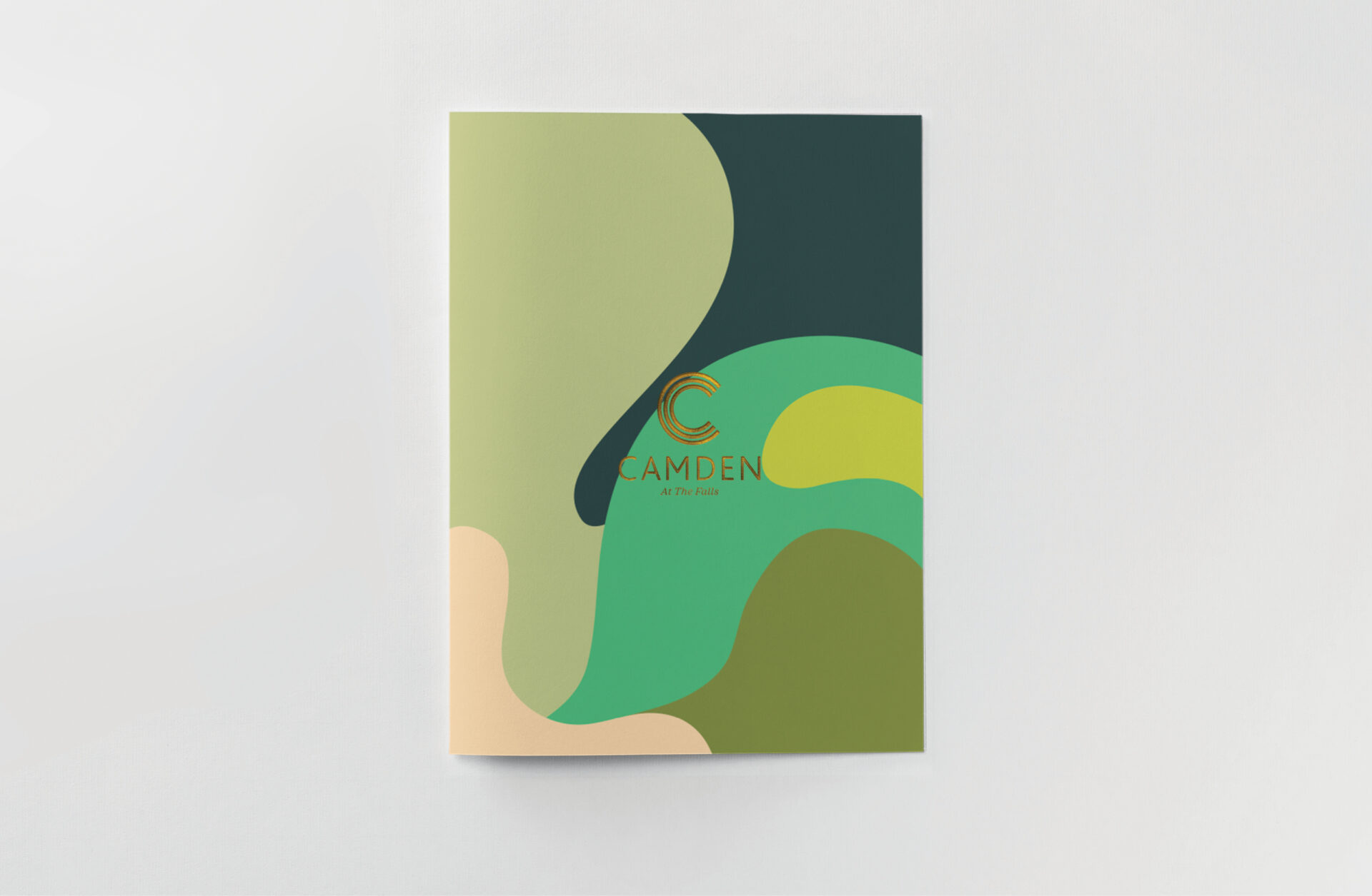
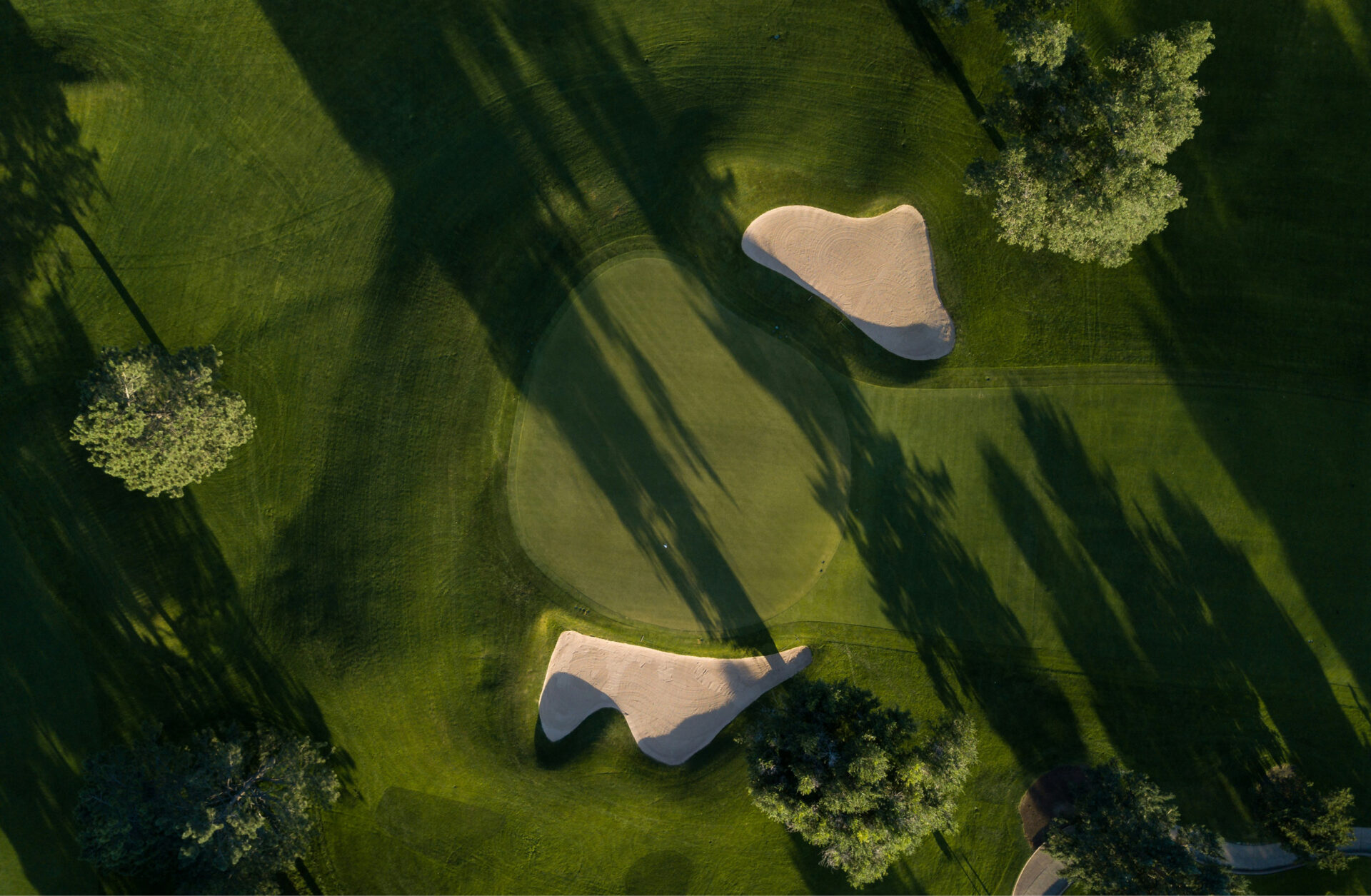
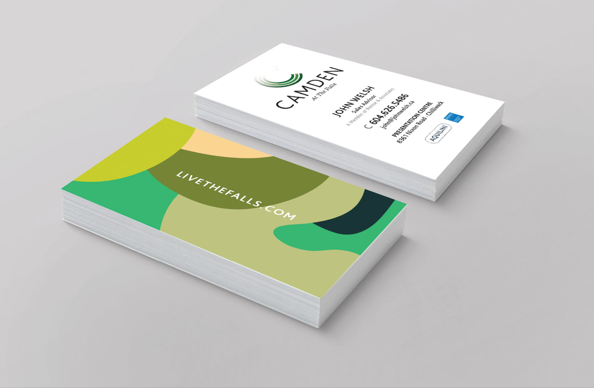
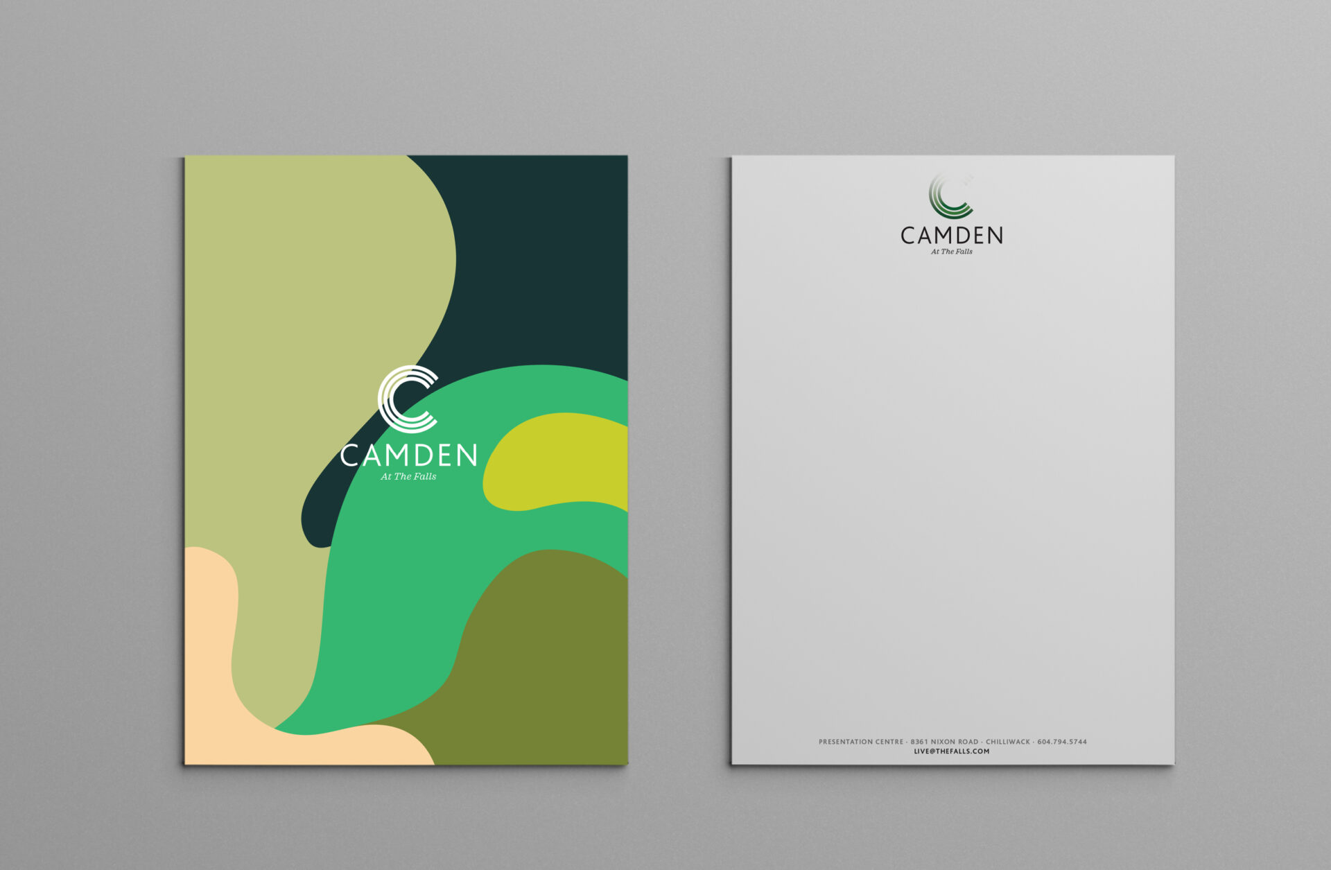
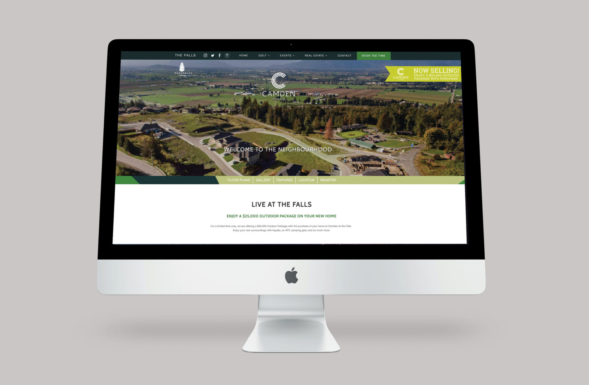
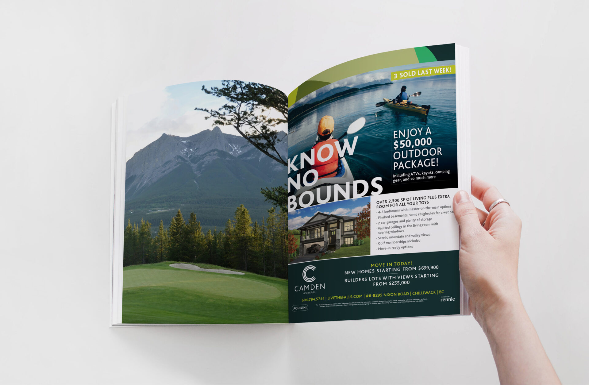
When our friends at Aquilini Development brought us in to brand Camden at the Falls, we didn’t have to look far for inspiration. The sweeping greenways of their world-class golf course in Chilliwack, BC, offered the perfect starting point. The brand’s visual identity emerged from a series of green, interlocking topographic shapes, echoing aerial views of the course and the natural contours of the land. The bold capital “C” in the logo was designed to reflect the arc of a golfer’s swing, anchoring the brand in both movement and place.
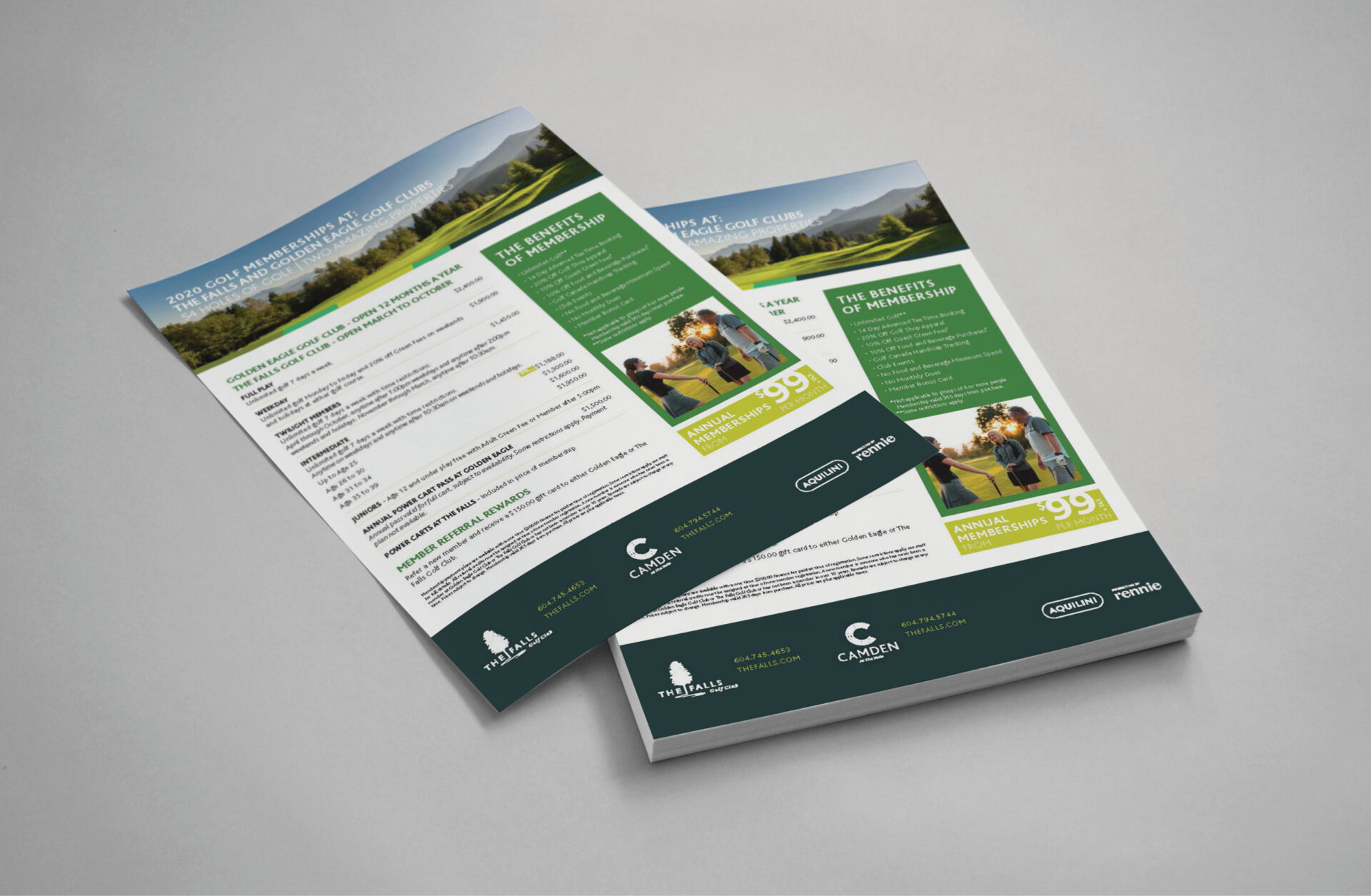
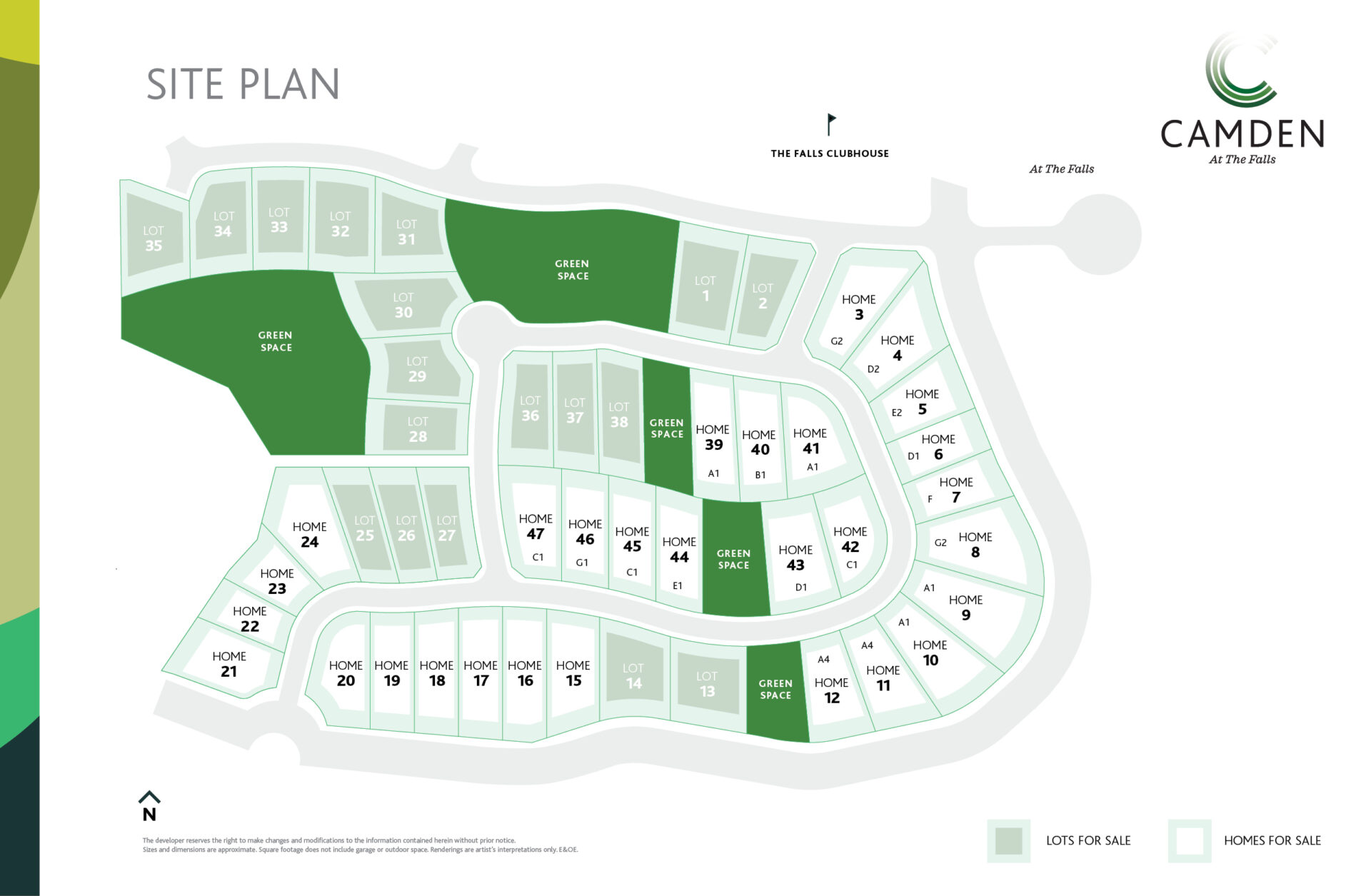
We developed a complete brand system from logo, colour palette, typography, and custom brand patterns and extended it across all sales and marketing materials. This included elegant print assets such as brochures, floorplans, feature sheets, and neighbourhood maps, as well as on-site signage, large-format hoarding, and billboards. A dynamic digital presence supported the campaign with targeted digital ads, social content, and a polished website. Designed to connect with a younger, adventurous homebuyer seeking value and a rural lifestyle, Camden at the Falls brought fresh energy to the project and real momentum to sales.
Date:
2020